DroneDeploy Projects Homepage

Enterprise Web App Redesign
My Role: Design Lead, end-to-end design.
Timeline: 4 weeks (2 sprints).

The Challenge: Redesign DroneDeploy projects homepage to help scale the product from a focus on individual customers to enterprise accounts.
Overview
I was design lead and the only designer on the Enterprise team within DroneDeploy. The job of the Enterprise team is to help scale our product as it shifts from a focus on individual pilots and SMB companies to large enterprise organizations with team numbers closer to 500 or more. This project involved end-to-end design from initial user (and company) research to final hi-fidelity handoff. The success of the project will be measured on an ongoing basis. This measurements will focus on general usability feedback, user retention and performance optimizations. The design portion of this project was handed off on a 4 week timeline.
Why does it matter to DroneDeploy?
DroneDeploy is a drone software solution that helps businesses in industries such as agriculture, construction and mining collect, manage, and interpret their captured drone data. DroneDeploy is in the stage of moving from an individual software solution to an enterprise solution. The original dashboard design struggled to handle this scale. The enterprise team set out to design and build a projects dashboard that catered to our enterprise accounts. The focus was on an ability to handle grouped organizations, project permissioning and hundreds of flight plans while not leaving our original supporters - the individual pilots - behind!

Results

Before

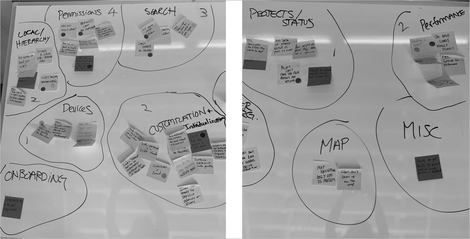
The original projects homepage had limited search options, inability to create nested folders and a load time of over 5 seconds. Administrators didn't have access to their pilot's projects and finding a project became a large burden when your list exceeded 25 projects. On top of that the list order would change constantly. Essentially, the dashboard could not scale.

After

A focus on technical improvements, search result optimizations, administrative access and general project and folder organization created a projects homepage that could allowed for customer growth and supported enterprise level clients.

  1. Global Search
    Primary way active users find their projects.
  2. Quick Access to nearby and frequently viewed projects
    When you are onsite in the field, often with poor cell service, quickly accessing the projects nearby and the project you are on is key.
  3. Full page layout and increased contrast
    Took advantage of a full page view for a content rich page. Visually highlighted sharper contrasts since our app is often viewed in tough environmental conditions with high winds, bright sun, and dust.
  4. View all projects 
    Previously our app limited the map view to 25 projects only, admins now have access to all projects.
  5. Sorting capabilities for projects
    Easily sort through hundreds of projects and folders by activity, date and name.
  6. Folders and subfolders
    Teams are often broken up by region and subregion, previously our application lacked the ability to create subfolders creating an organizational burden on many of our customers.
  7. Project Status 
    Ability to quickly identify program activity in large organizations.

The Process

TL;DR I implemented a flexible version of the GV design sprint to help with our team communication gap and to ensure alignment during a massive redesign and engineering focused project.

While the focus of this project was feature discovery and page redesign I was keen to use this time to implement new processes between the design, engineering and product teams. When I first came onboard I noticed that our Enterprise “pod” struggled with a communication gap. Our engineers were remote and our product team moved fast, because of this several key decisions would get lost in translation. This project involved feature changes, performance enhancements (working through tech debt) and a complete new design. I knew our success depended on transparency and communication.  My personal goal was to involve team members in the process early and often. This keeps motivation high on tight deadlines and helps limit time wasted relaying information to individuals. To accomplish this goal I followed a flexible version of the google design sprint. I asked everyone on the team for 1-2 hours of their time each week to participate in the process. They agreed enthusiastically. While it sounds like a big ask when you are running on a tight engineering budget it proved its value immediately. From the start, the team was aligned on the process and key decisions, I was able to design within our realistic constraints, and asset handoff was able to happen on an iterative basis to keep the process moving.
Phase 1: Understand Customer and Business Needs
Our first goal was to create a shared knowledge base across all team participants, articulating the problem space from business, user, competitor, and technological angles. I invited two Engineers and our Product Manager to lead 'lightning talks' on the history of the project dashboard. The Engineers covered the technical history of the page cuing us into limitations that would effect design and engineering team’s ability to estimate on and build specific features. 

Our Product Manager spoke to the design decisions that had been made for the initial dashboard build. We also reviewed current research we had done up to this point -  a collection of survey results, qualitative research and general customer feedback so that everyone understood the challenges our customers  were having. This created a shared sense of empathy for why we needed to prioritize a fix.
How might we...
After the team lightning talks I led a design studio focusing on 'how might we' statements. We grouped the final details by themes which we wanted to test against.
My shadow is always determined to make it into the whiteboard photos.
After coming up with the themes and working with the Product Manager to prioritize, I gathered a list of hypothesis to test. When we initially began the research phase, this project had the potential to go in several directions. At every stage it was important to verify our needs and establish focus around the job of the page and the audience it was being built for. I came up with the following hypothesis to test against:
  1. The primary use case of this page is to find a specific project, or create a new project.
    Verified
    “The projects are cumbersome as an admin... we ask pilots to group their flights by a folder but they don’t do them. I’m seeing everything and its overwhelming."
  2. Mobile use will differ from Desktop in ways that require different primary features options.
    Verified
    Pilots in the field want to prioritize new projects or those that are very nearby.
    “People hate being brought to their own location when creating a project on desktop because they are generally creating projects in remote and alternative locations”
  3. Making better use of screen reality and contrast will help our customers with accessibility
    Verified
    Our customers are often accessing this app in tough environmental conditions - high winds, bright sun, dust, we need to have sharp contrasts for easy viewing.
  4. Current permissions system is insufficient for the complexity of many customer operations. Verified
    “If I could wave my magic wand...folder structures would have permissioning.”
  5. Customers will want to curate a list of pinned projects that are easy to return to.
    Negated
    “Not sure what pinned would be, near me seems useful  to fly”
  6. We can do without a map view as map is not critical for customers to find their projects. Negated
    Map view is key to our customers, they often deal with projects in remote locations where a street address or county isn't available to search by.

Phase 2 + 3: Define Requirements + Sketch

Pulling from my research, I worked with product to engineering to help prioritize the work and set requirements. In order to best communicate with engineering and set expectations on deadlines it was important to scope the priorities by sprint and communicate the relationship of each sprint building on top of eachother.

Sketch

Working in parallel with these requirements it was time to sketch

Phase 4: Decide

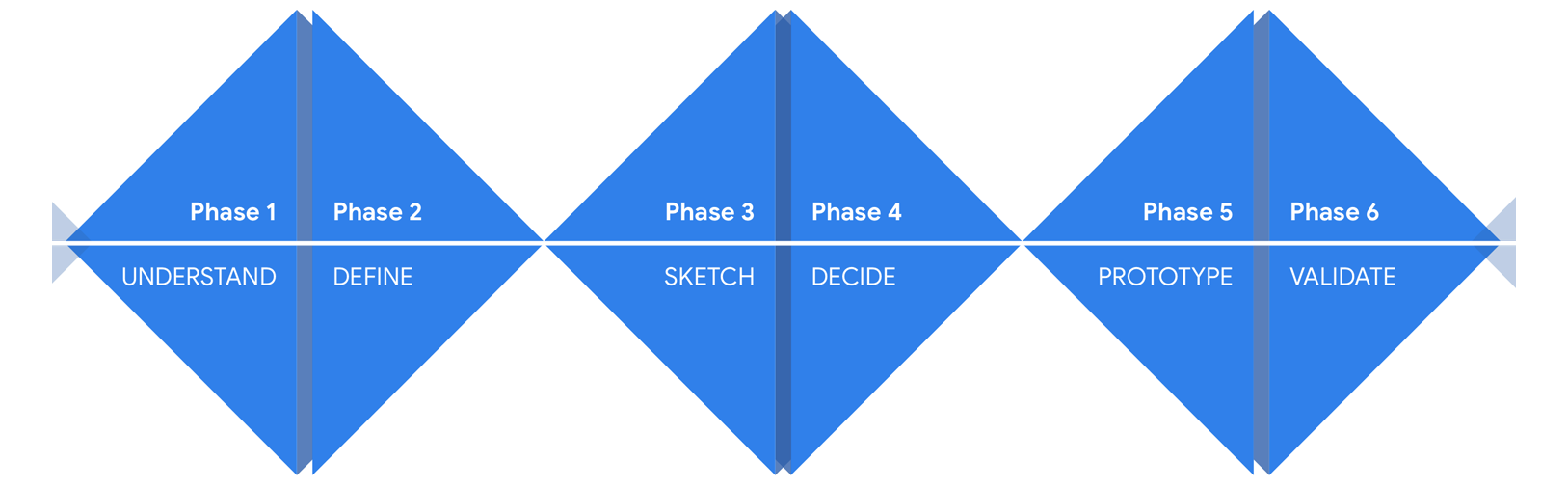
From here the team and I decided on the direction of the final concept. We ran this by the Head of Product and our CEO for approval. After we received the thumbs up I put together wireframes so that engineering could start working on backend functionality while I started on high-fidelity.

Map and view toggle options
Create folders and subfolders
Move folders
Search and results

Phase 5: High Fidelity

After putting together wireframes and task flows to lay the foundation it was time for high fidelity refinement and prototypes.
Initial concepts
While this project was going on , the design team was also in the midst of updating our general styleguide and brand. My initial designs stayed within the constraints of our brand colors and themes.
Refined for handoff
After reviewing these high fidelity designs with the team and looking back to some of our initial goals (especially in regards to accessibility onsite) it soon became clear that our brand guidelines were outdated. The timing was perfect, it opened the door for us to begin updating our styleguide and components using this project homepage as a start for the new look and feel.

The Result

Responsive web view
Styleguide for handoff

What's next: Validation + Map View

In order to measure the success of the project I will be following up with qualitative user research. The team and I also use mixpanel to track interactions such as opting into the new dashboard and monitor load times on various devices.

Delivering an interactive map for our customers became an obvious need during the user research of this project. Unfortunately when we estimated the engineering effort it was out of scope. We will be focusing on a fast follow to toggle from a map and grid/list view as well.